Carrot's Super Cool Tutorial for Making a Snazzy Animated Menu for All Your Sweet, Sweet Ren'Py Visual Novel Needs
HELLO, DEV FRIENDS. HAVE YOU EVER WANTED TO MAKE A SUPER SWEET AND COOL ANIMATED TITLE MENU FOR YOUR REN'PY GAMES???? Omg... what a coincidence... BECAUSE I HAVE WRITTEN A GUIDE. VOILA!!

I am making this guide because.............. I feel like there's not a lot out there for title screen stuff and animation in general! A lot of the stuff I'll talk about how to do in here is stuff I mostly taught myself through a mixture of things I've picked up from working on my own games and a lot of trial and error. The great thing about Ren'Py in general is how easy it is to pick up and start making some pretty cool stuff. But moving beyond showing some images and sprites and text on screen to some of the more advanced stuff, particularly involving menus and screens (MY MORTAL ENEMY) can be really hard even if you've been working with Ren'Py for a while. I KNOW IT SURE TOOK ME A LONG TIME AND I'M STILL NOT THAT GREAT AT IT. When I first got started, I found it hard even following tutorials for simple stuff because I really just had no concept of what I was doing and found everything nearly incomprehensible. So I'm going to try to gear this guide towards people who might not have much background at all using Ren'Py and, as such, will also try to explain some of the relevant weird stuff about it and what everything does in as uncomplicated a way as I possibly can. HOWEVER, IF THERE'S ANYTHING YOU DON'T UNDERSTAND OR NEED ANY EXTRA DETAILS ON ANYTHING, PLEASE FEEL FREE TO ASK!!
Anyway, let's get started!
WHAT DO I MEAN WHEN I SAY ANIMATED MENUS.
ALSO WHAT KIND OF ANIMATED MENUS HAVE I EVEN DONE THAT I CAN SAY THAT I CAN WRITE THIS GUIDE??
Those are both good questions. After all, you wouldn't want to follow a guide written by someone who has no idea what they're doing /insert awkward cowboy emoji here
Here are some of the menus from my games:

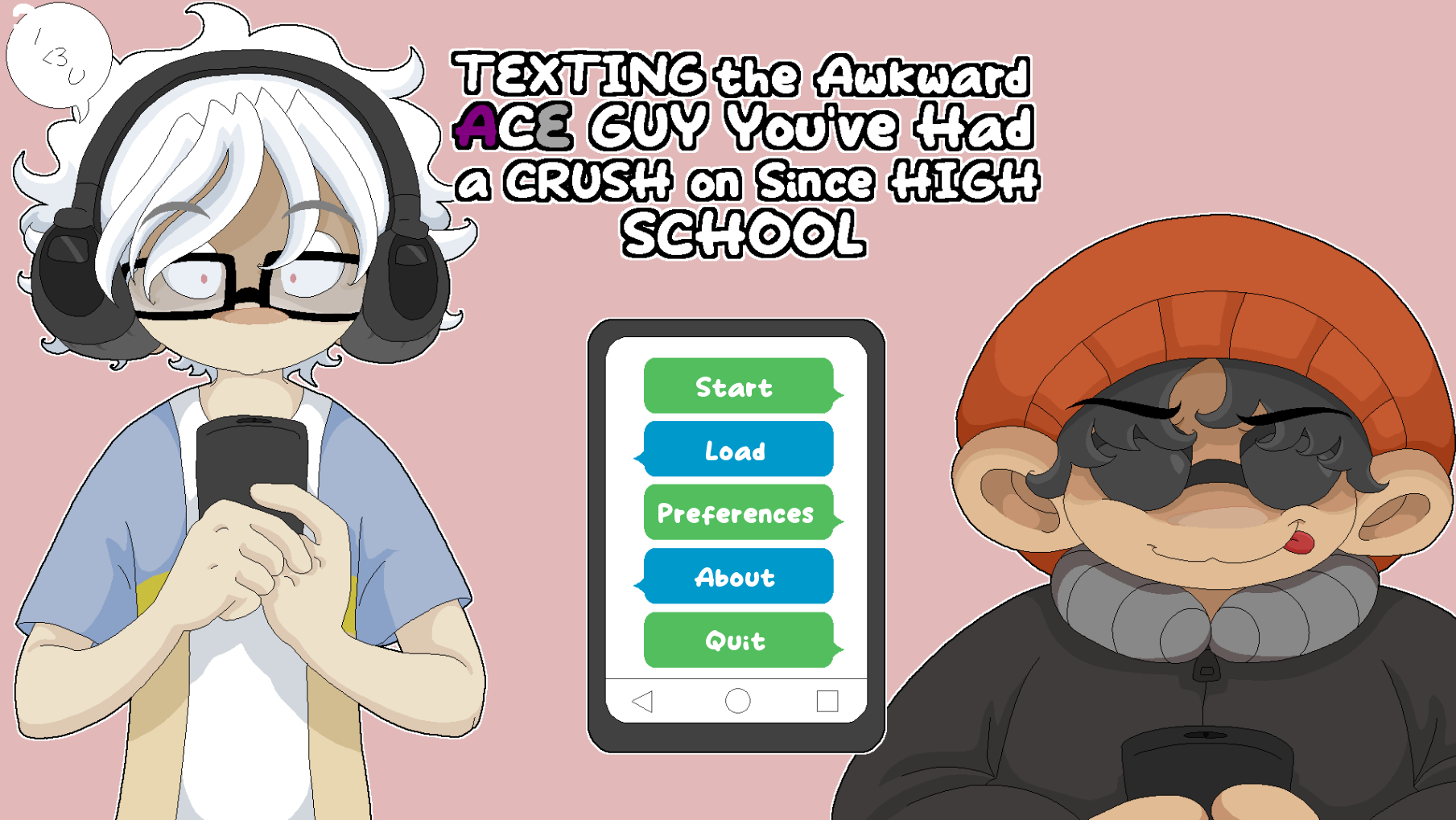
This is from my main ongoing game Our Wonderland and is one of my simplest title screens as it's the first title screen I created. Well actually there's an even simpler version -- this is from the final arc where I did update it to make it a bit more dynamic. But it's still relatively simple in comparison. The character shadows update over the course of the arc to show each character once you play through their part.

This is from my second game, Our <<Fantastic>> Wonderland, which I made for Spooktober 2022. This is where I started to get a little bit unhinged????? Why are so many things happening???? Who can say. Similar to the first gif, the characters on the right will start as shadows on your first playthrough but will be revealed over time -- in this case, for each of the three endings you get.

Aaaaaaand here is the title from my most recent game, Texting the Awkward Ace Guy You've Had a Crush on Since High School (try saying THAT five times fast....) that I made for O2A2q in April 2023. This one doesn't have any updating shadows or anything like the other ones, though it does change slightly after you get the good ending.
This last one is the one we'll be re-creating for this tutorial! I've chosen this one because it includes the largest variety of changing parts, so I feel like if you can make this one, then you'll be able to make just about anything else LOL So hoist up your bootstraps and let's get started!!!1!!1!!!1!!
1. Setting up your project! Also images! Download them!
I figured the easiest way to go through the tutorial is if you have all the resources you need already and can just focus on what you need to do with those resources in the code, so I've zipped all the image files you'll need to re-create the above title screen and uploaded them as an extra file that you can download on the game page:
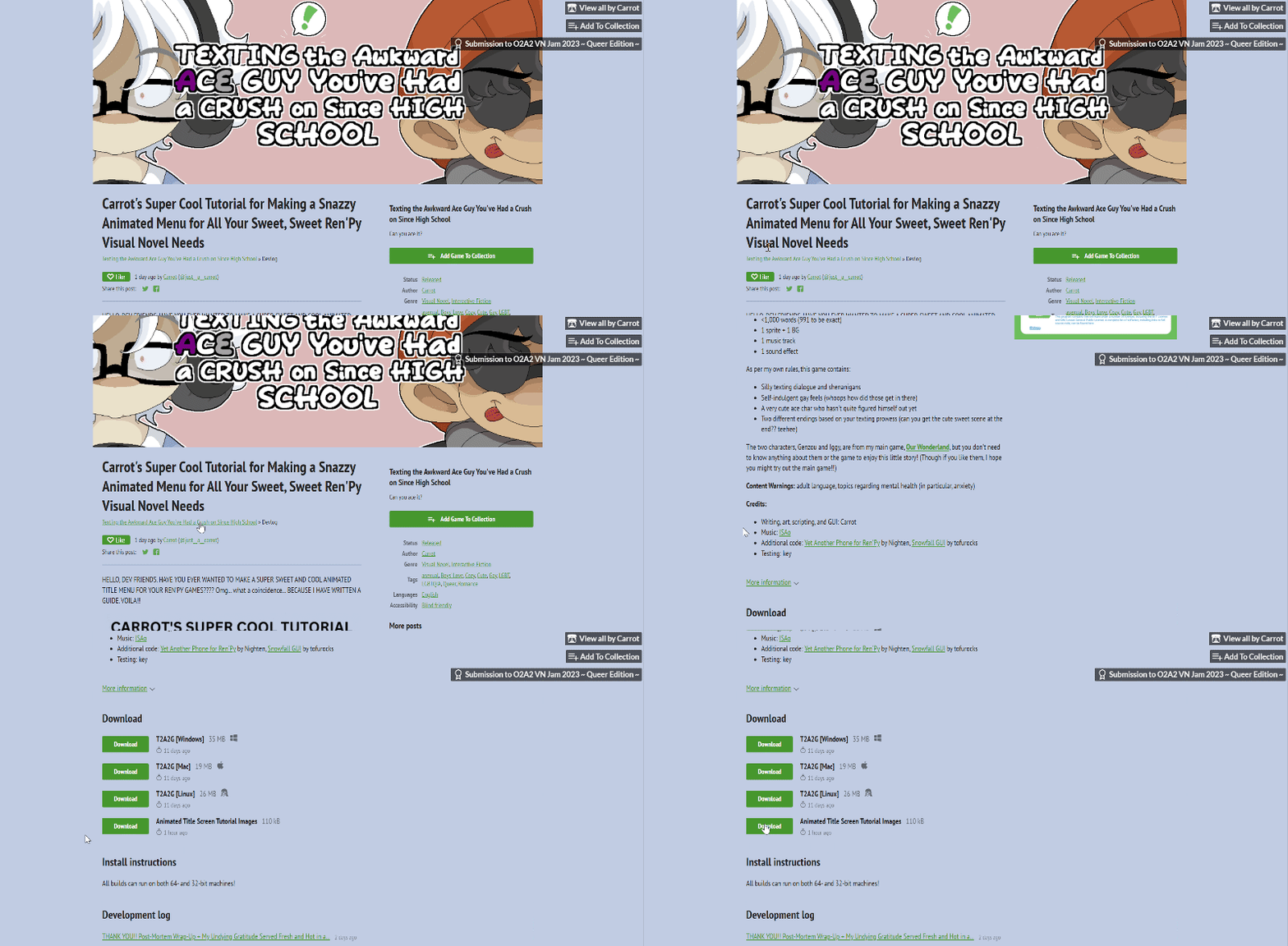
Go to the main page for the game, scroll down, then find where it says Animated Title Screen Tutorial Images and click Download to download the zip file with all the images!
Of course, you don't actually have to re-create this title screen exactly if you don't want to. You can also follow along using your own image files and just yoink bits and pieces of the tutorial as you go, changing things as needed to suit your files better. But sometimes jumping straight to that can be too difficult or overwhelming, so for those people, you can just follow along exactly with the provided images without having to worry about making any changes.

When you unzip the folder, you'll see all the images! WOAH. Notice how each image (except for "menu_message" and "menu_question") is the full 1920x1080 pixel size even if the actual image itself is much smaller. I do this for most of my images where I want it to show up at a certain specified spot on the screen. It just makes it much easier to plan out the complete image in my art software (I use Aseprite) and then have it appear exactly as I want it to on the Ren'Py screen without needing to carefully place each piece manually in the code. So I do this with CGs, for instance, and stuff like the title screen. However, I don't do this for sprites, as sprites need to move around a lot!
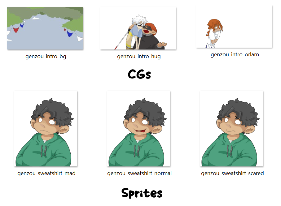
This isn't extremely relevant to the tutorial but wanted to bring it up just in case it helps clarify stuff or why you might want to make images in a certain way! The CG images on the top are supposed to be layered, and they all have the dimensions of the full Ren'Py screen (in this case, 1280x720) so they'll show up on the screen in the exact location they do in my art software. The sprites on the bottom, however, aren't like this. They all have the HEIGHT of the Ren'Py screen (in this case, 720); however, since sprites often need to move around the screen, their WIDTH is only as wide as the sprite itself. Not to say you can't make full-screen images move around, but it's just easier to do with smaller ones. Or something.
Anyway, moving on!!! You'll want to set up your project. If you're just doing this tutorial completely on its own, I'd recommend setting up a new Ren'Py project from scratch. Make sure you set the dimensions to 1920x1080. This is because the provided images were all drawn at this size. I don't usually draw at this size because it's very difficult in my art software LOL However, for this game I did because the base template I used for the text messaging required 1920x1080 (my other games are all 1280x720).
Once you've set up your project, dump the images from the zip file into your new "images" folder that should have been created inside of it:
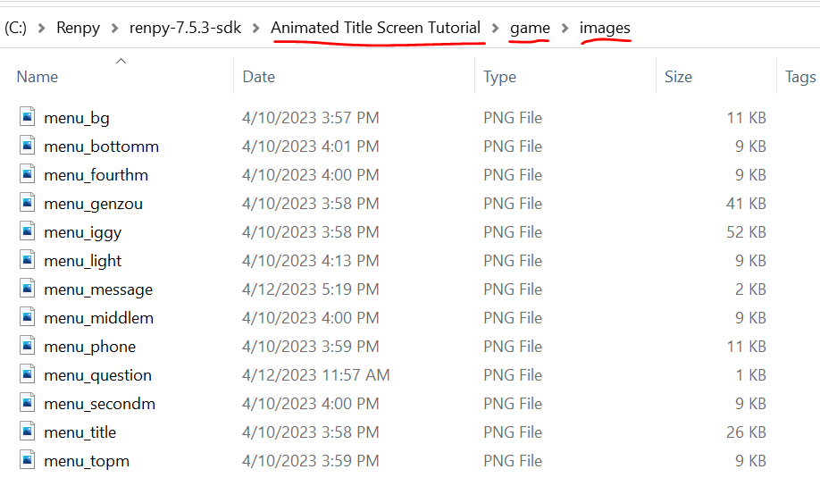
I called this project "Animated Title Screen Tutorial," but you might have named it something different. Either way, you'll find the "images" folder inside the "game" folder of your new project. Dump all those images in there!!!!
That should take care of all the prep work. Which means it's time to get started actually coding some stuff! WOO!!
2. Working with screens! What are they???
If you go ahead and start your new project now, you'll see something like this:
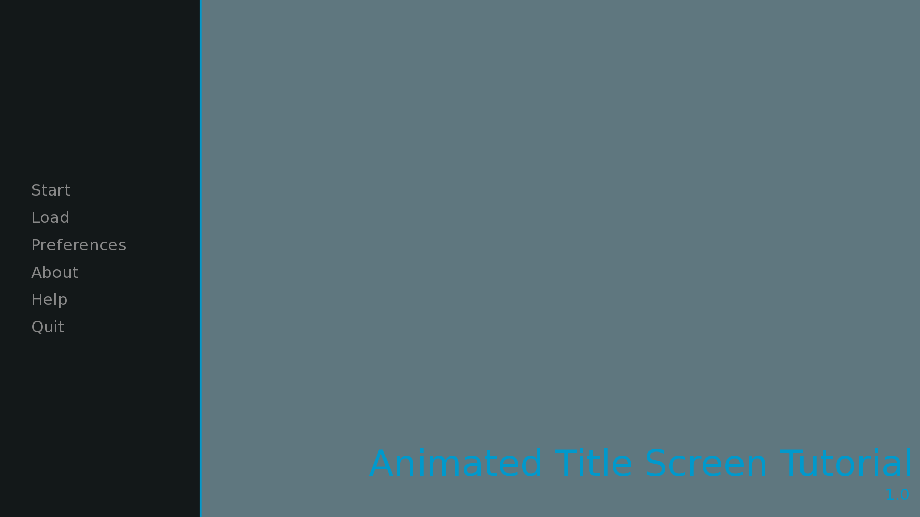
This is the default Ren'Py title screen! As you can see, there's quite a bit here we're gonna have to change!!!!
Let's start by getting rid of that giant title and version number on the right. You'll end up getting rid of this on most of your games. Well, I do, at least. Because I always add my title as an image instead. It's up to you, though! For this tutorial, though, you do have a logo with the title to add, so you'll definitely want to get rid of it.
To do this, open up your "options.rpy" file in your text editor and change this line:
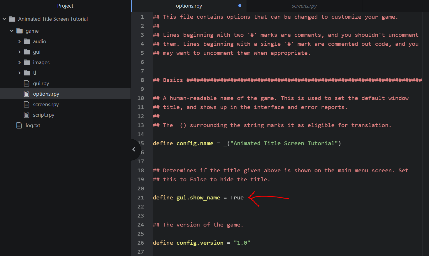
Right now, it's set to True. In other words, it's true that Ren'Py will show the name of the game on the title screen. We want it NOT to be true -- a.k.a. false! So change the True to False. Mind the capitalization! In Ren'Py, you need to always capitalize True and False in order for them to be read correctly.
Once you change this to false and save the file, reload your game using Shift+R (a handy trick!), and you'll see that the game title is now gone:
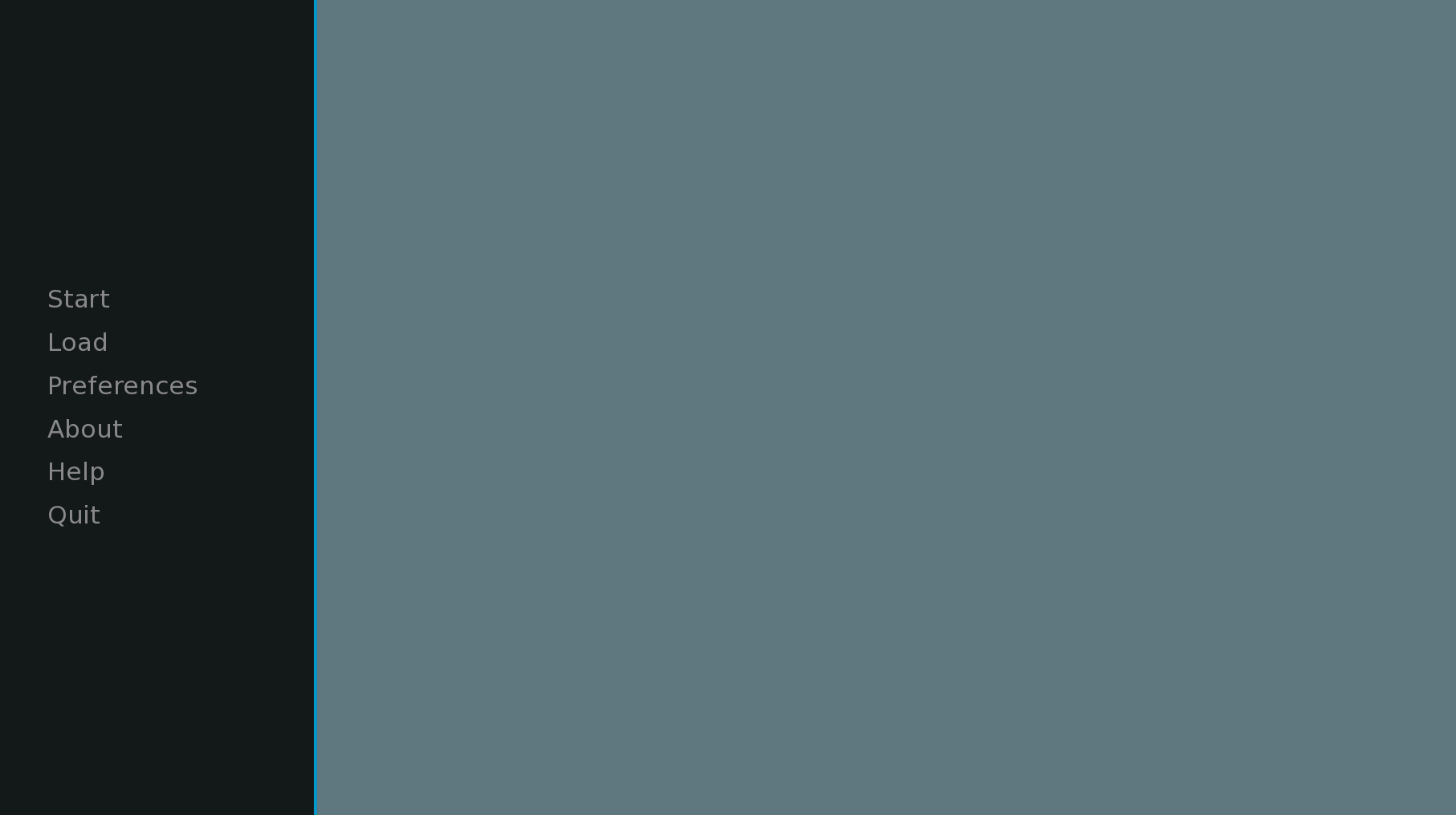
Sweet!
The thing I usually like to do next is just load all the images onto the screen. This gives me a nice base to work with before I start moving things around or animating anything. It also keeps me from getting overwhelmed by trying to do too many things at once or trying to do things without being able to visualize anything!
But how do you add images to your title screen??????? THAT'S A GOOD QUESTION!
The title screen is, as you might be able to glean from the terminology, a screen. What exactly is a screen? This is a concept that took me a long time to really wrap my head around when working with Ren'Py -- what are all these screens people are talking about?? What do they do?? What is the point of any of this?!?!?!?! And tbh I still have trouble a lot, so don't fret at all if it takes a while to feel more comfortable with a lot of this stuff LOL
The way I think of a screen is like... layers. You've got the window of your game, and within that window, you can have a variety of different layers with different content inside of them. Screens can contain images, text, buttons... anything, really! And you can stack screens on top of each other! For instance, if you had a really complicated game with variety of stat windows all displaying different stats and text, you could have each of these be a different screen and they could all be stacked on top of each other to show at the same time. You can do things like set different z-orders to determine which screens show on top of each other and even have different menus and clickable things on different screens.
All of the main screens in a default Ren'Py game are included in the "screens.rpy" file:
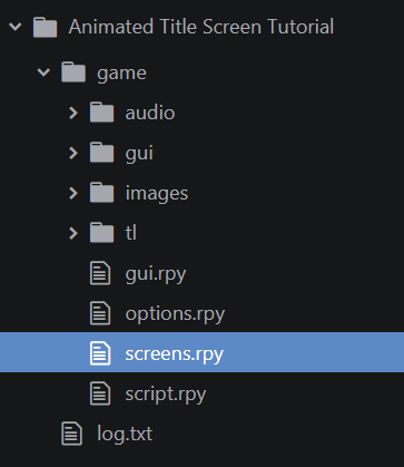
In here, you'll find screens for everything! Your main menu, your say screen (the dialogue box where your characters speak), your choice screen (the options that pop up when you want players to make a choice in your screen), the about screen, the help screen, the history screen, and many others! All of these are just different layers of stuff that you can call to display on your game window at any point in time. You can change anything you want in these default screens and also create your own new screens if you want! Just don't delete any of the screens or you may run into issues LOL Some of these screens show on top of each other at the same time when you're actually playing the game. Others only show up when you click a specific button or option.
The two screens in this file you'll be dealing with the most in this tutorial are:

The navigation screen! Think of this screen as the actual menu options displayed on the title and menu screens. So, in other words, the little list that says things like Start, Load, Preferences, etc. It's shown ON TOP of other screens (e.g., the main menu screen that's shown when the game starts, and the game menu screen that's shown when the game is paused).

And the main menu screen. Think of this as the backdrop for your title screen. It's where you'll add all the images that will be shown! The navigation screen will be shown on top of this screen.
It took me a long time to understand the differences between these two screens! After all, you would think that, for instance, the main menu screen would have all the menu options, right? That seems logical. But that's actually a separate screen -- the navigation screen! It's better, then, to think about the main menu screen as being the background of the title screen and the navigation screen as being the menu of the title screen (and also for other screens, but we'll get into that later).
So, then, if the main menu screen is the background, then that's where we want to add our images!
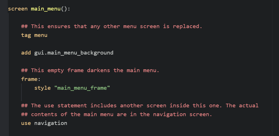
Below screen main_menu(): is where all the code for the main menu screen goes.
Don't touch tag menu or use navigation -- both of these are important for the main menu and navigation screens to be shown correctly. The other two elements here, though, we can do things with!
The frame: style "main_menu_frame" code is what adds the little black frame on the left of your screen. You can delete that as you don't need it! Try deleting it and refreshing your game. You'll see it's disappeared:

Next is the add gui.main_menu_background -- this is the image currently being displayed! Let's break it down:
- add is what actually adds the image to the screen. In your main Ren'Py script file, you add images using the show command, but whenever you're working within a screen, you need to use the add command.
- gui.main_menu_background is a variable. It refers to something defined in the "gui.rpy" file (there are a lot of things defined in the "gui.rpy" file):

When you go to the "gui.rpy" file to check, you can see that main_menu_background is defined as "gui/main_menu.png", which is an image located in the "gui" folder of your project.
Well, none of this matters too much! We want to replace it anyway.
Let's go ahead and delete that line and, instead, add all the images that make up the title screen.
VERY IMPORTANT WHEN YOU'RE DOING THIS: Make sure you add the images in the order you want them to appear on screen. Images that you add first will show up on the bottom, and each new image you add will show up on top of the previous image.
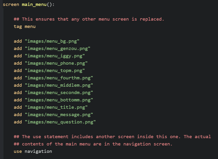
The order doesn't matter exactly for every image -- the most important things to remember are that the "menu_bg.png" file should go at the very top, as it's the pink-colored background, and that "menu_phone.png" needs to be above all the little message bubbles such as "topm," "fourthm," etc. since the messages need to be displayed on top of the phone image. For now, don't add the "menu_light.png" image as it's the flashing dot of the phone and will be animated -- we'll work on that later.
Once you've added all these, reload the game and see how it looks:

Not too bad!! Most of the images look fine. The only ones in a weird place are the question mark and bubble -- that's because those images weren't the same size as the entire screen, so they need to be placed manually in the code. Also, of course, the actual menu items are still located on the left-hand side of the screen. But we'll work on that in just a bit! At least right now, we can see that everything's loaded correctly and is visible on the screen, which is good!
3. Get that dang menu in the middle of the screen!!!!!
OK because it's bugging me the most, let's go ahead and move the menu into the middle of the screen and onto those lovingly laid message bubbles. Remember what I said about how the menu itself is actually part of the navigation screen? That means you'll need to scroll up from where you added the images to where it says screen navigation(): -- that's the navigation screen!
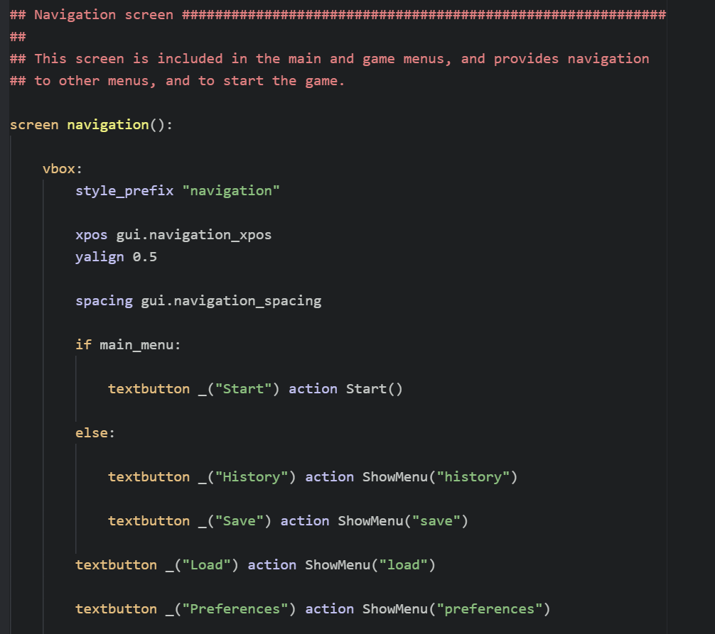 At this point, I'm going to need to make things slightly trickier, but I'll try to explain this as best as I can. There are 3 different places where the navigation menu is shown in the game:
- On the title screen
- On the game menu directly connected to the title screen (e.g., when you click load or options directly from the title screen)
- On the game menu while playing the game (e.g., when you're in the middle of playing a game and open the menu)
Here's a visual of each of these in T2A2G:
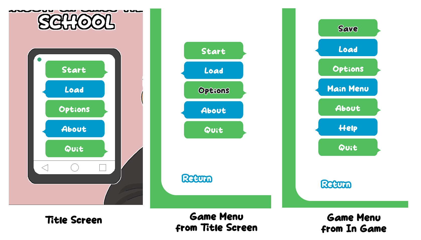
They differ in a few ways:
- The Title Screen and Game Menu from Title Screen both have a Start option and lack a Save option
- The Game Menu from In Game has a Main Menu button that goes back to the title screen (and it also normally as a History button, as well, but I've gotten rid of it in this game, because it's very short)
- In these images, you'll see the Help button is only in the Game Menu from In Game, but that's just because I got rid of it in the other versions (a default Ren'Py project will have it there tho)
Why is it important that you know how to manipulate each of these three menus in different ways?
- Their placement on the screen!! This is the most important, as you'll often want the menu to be in a different position on the Title Screen than you will in either of the Game Menus
- The different amounts of buttons may mean you need to alter parts of your UI for each of the different screens (in this case, I had a different number of message bubbles that needed to appear on the different screens)
Keep these three different versions of the menu in mind as we continue into the next part with various aspects of the code!
So what part of the code is telling your menu where to be right now? It's these three lines right here!
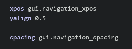
The xpos here is telling the menu where to be horizontally. The yalign is telling where the menu to be vertically. And the spacing is telling the menu how much space to have between each of the items in the list.
Right now, two of these are being controlled by variables in the "gui.rpy" file -- gui.navigation_xpos and gui.navigation_spacing. However, we want to control them directly, so we'll replace those variables with numbers!
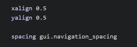
Figuring out what numbers to use is difficult. Oftentimes, you just have to do a lot of trial and error, changing lots of numbers and carefully tweaking things until they look right. In this case, for instance, I know I'd want to center the menu first, so I'd get rid of the xpos and replace it with an xalign, which will align it relative to the screen rather than place it in a specific position. For instance, an xalign of 0.0 would place the menu on the left-hand side of the screen, an xalign of 1.0 would place the menu on the right-hand side of the screen, and an xalign of 0.5 would place the menu smack dab in the middle of the screen!
Let's start by simply moving the menu to the middle of the screen and see where we need to go from there. Delete xpos gui.navigation_xpos and write xalign 0.5 instead:
Now, reload the game!
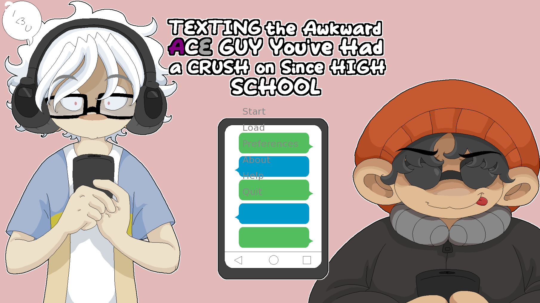
Interesting. Well, the menu is in the center now. But we can see that it'll actually need to be a bit more to the right to fit into the bubbles. Also, we need to center the words themselves within the menu, as well. It'll also need to be moved down just a little bit.
Let's fix the centered words first. Scroll down a little bit in your code until you see this bit:

This is a style property! Style properties are used to, well, give styles to various things! In this case, it's giving a style to everything labeled as navigation_button_text. Which, if you scroll back up to main code of your navigation screen, is these elements:
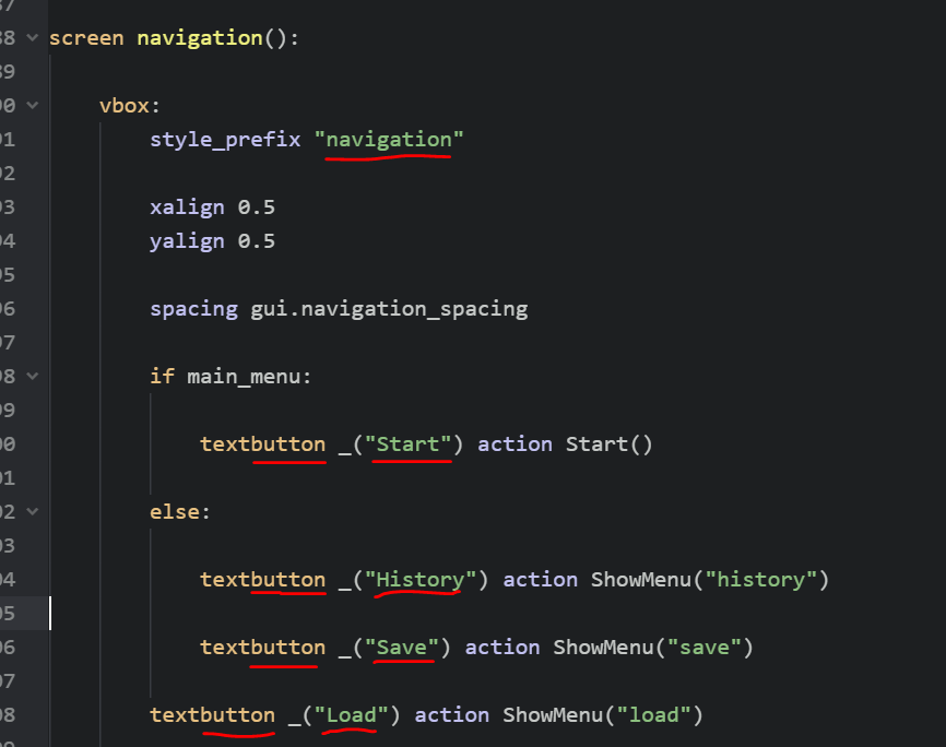
Note the style_prefix -- that's the prefix for the style, which, in this case is navigation. This means that everything below this will be treated as having the navigation prefix. And there are some buttons below it! So all those buttons you see have the navigation prefix. This means that the style property you were just looking at affects the text of all these buttons. Great, because we want to center that exact text!
To do that, all we need to do is add an xalign to the style property. Setting the xalign to 0.5 will center the text, just like it centered the menu on the screen. Go ahead and type xalign 0.5 under the style property:

Save it again and see if the words are centered now!

Great!!!
Before the next step where we start aligning things in much greater detail, let's pause a moment -- you've probably noticed that the text of the menu on your screen looks different from the text in the original animated gif I showed at the top of this tutorial. That's because I have a few other style properties also assigned to the text (in addition to the xalign 0.5 you just added). These include things like fonts, colors, and outlines. Here are all the style properties I've added to the text:

- First up is the font. You'll see here, the font I've used is "Take Coffee.ttf" -- you can download that font here: https://www.dafont.com/take-coffee.font You don't have to, but you may have to make a few small additional tweaks to the positioning if you don't since the words will be a slightly different size. If you download it, put the "Take Coffee.ttf" file in your "game" folder.
- Next up is color. This is the main color of the text. In this case, I've made it "#ffffff" which is white.
- Below that is selected_color. This is the color that shows when the text has been selected and is active (e.g., which menu you have open in the menu).
- Then is hover_color. This is the color the text turns into when it's being hovered over.
- Finally is selected_outlines. This gives the text a cool outline only when it's selected (similar to selected_color above)! In this case, it's 2 pixels wide and is white. The other options will move the outline horizontally or vertically. But in this case, we just want it to be directly around the letters.
Go ahead and add all these properties under your style navigation_button_text, then reload your game:

Sweet! That's looking better already.
Now to actually get that text where we need it to be!!! When I was making this title screen, this required a lot of tweaking, testing, retweaking, retesting, again and again and again......... BUT YOU DON'T NEED TO DO THAT BECAUSE I'LL JUST GIVE YOU THE NUMBERS YOU NEED DLKJALDSKFJDS
Go ahead and update your xalign, ypos, and spacing in your navigation menu to these numbers:
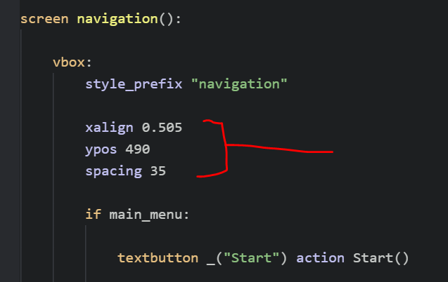
Reload the game, and you'll see that your menu options now sit perfectly atop the messages. Wonderful.
EXCEPT FOR ONE THING???? There's one too many options oh noooOOOooooOOOOOOO!!! That's because in my version of the title screen I yeeted the Help button (it's still accessible from the Game Menu from In Game, just not as an option from the Title Screen or Game Menu from Title Screen).
How can you get rid of that in your project? Well, let's go find the Help button. You'll find each of the buttons of the menu as text buttons within the navigation screen. Here's the Help button:

We want to get rid of this from the Title Screen but still make it so it shows up in the Game Menu from In Game. Remember back to the three versions of the menu from earlier? How the Help button was only on the Game Menu from In Game (because I got rid of it everywhere else)? To access just this version of the menu, you'll want to use an if not statement, which will make it so something only happens if something else is not true. In this case, we don't want it to show on the title screen menu, so we'll add an if not main_menu above the code for the Help button, then indent all the Help button code so that it's "beneath" the if not statement:

This will make it so if the current screen is not the main_menu, it will show the Help button; however, if it is the main_menu, it won't show the Help button. The indentation here is really important! It's what tells Ren'Py that all the indented code beneath the if not statement is included in the if not statement. When the indentation stops and goes back to normal, then the if not statement doesn't apply anymore.
Give that a save and see what happens. Has the Help button disappeared?
It has!!!! AMAZING!1!111!!!1111
Omg... see??? It's slowly starting to come together!
4. LET'S START ANIMATING FINALLY???????
OK at this point we can actually start adding some animations in AWWWWWWWWWW YEAH.
How exactly do you make an animation? Well, all animations in Ren'Py are managed by transform elements. Transform elements can include things like... changes in position, changes in size, changes in transparency, and much more. And if you assign a transform to an element on your screen, it will follow all the instructions within the transform.
Of course, this is all very vague sounding without a solid example, so let's try making a transform for the first thing we want to have animated on the screen. If you'll rewatch the gif at the top of this tutorial, you'll see that first Genzou pops in on the right, then Iggy pops in on the left, so let's animate them first.
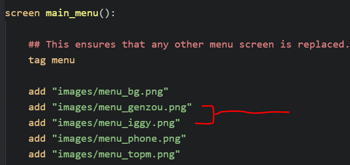
These are the two images in question!
However, you'll actually write your transform elements outside of the screen itself. In my case, I usually just add them above the screen, so, above where it says screen main_menu(). I just have a huge list of different transforms for every single element LOL
Let's write a transform for Genzou first:
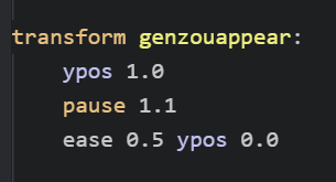
When writing a transform, things will happen in order from top to bottom. The things at the top will happen instantly, so they'll be what happens the moment the title screen appears. Well, if you watch the gif, you'll see that Genzou isn't there when the title screen appears! It's blank! That's because the very first command in this transform is a ypos 1.0. This command positions Genzou vertically so that the top-left corner is situated at the very bottom of the screen, making him actually off-screen. Here, I've tried to make an image to show this:
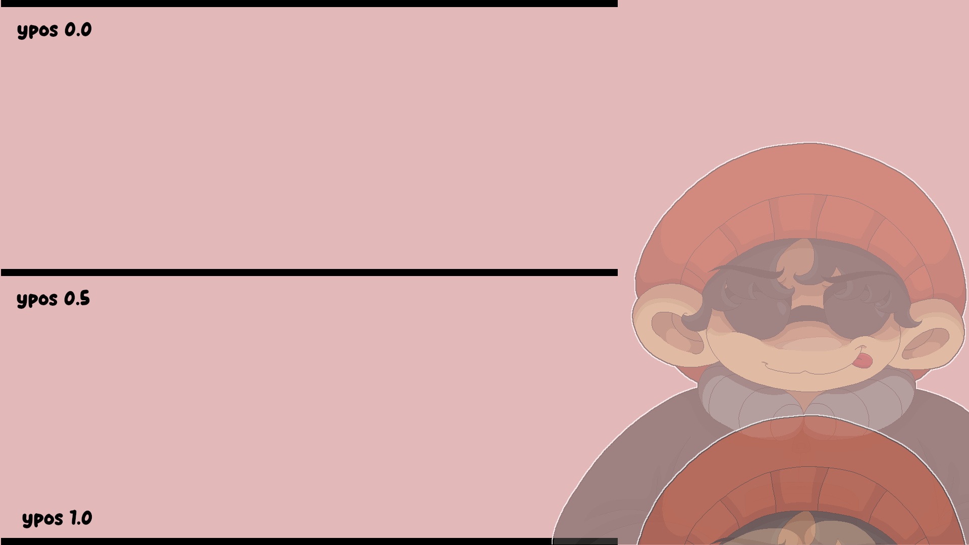
Remember that even though Genzou himself is small (teehee), the frame of this image is the full screen, so 1920x1080. So the top-left corner at ypos 0.0 will make it so the image is showing completely and fully across the screen. At ypos 0.5, only Genzou's hat is visible. And then at ypos 1.0, the entire image is fully below the screen.
So returning to the transform... when the title screen first shows, Genzou is located at ypos 1.0, meaning he is below the screen, not shown. Great. Then is a pause 1.1. This tells the transform to wait 1.1 seconds. This is followed by ease 0.5 ypos 0.0. This is the command that tells Genzou to appear! The ypos 0.0 repositions the image to ypos 0.0 (so, completely and fully across the screen, as we demonstrated earlier). And the ease 0.5 tells that repositioning to happen in 0.5 seconds with a slight ease on both ends (it'll have a nice soft fluid motion rather than moving straight there).
Wonderful. Now, of course, you need to actually assign Genzou that transform! You assign transform to elements using at. So down below where you've added the Genzou image, tack on at genzouappear (the name of your transform):
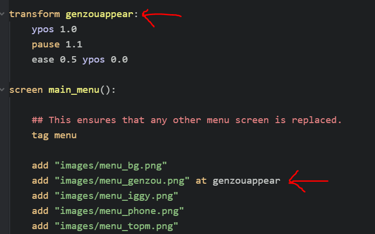
Great. Let's try it out! Save and reload your game:

OMG THERE HE IS LOOK AT HIM POP IN LKDAJFLAKDSJFLKSADJFLKADSJFA
Excellent.
Let's do something similar for Iggy. Iggy's transform will be almost exactly the same as Genzou's. The only different will be that the pause is a bit longer since we want him to pop in just a little bit afterwards:
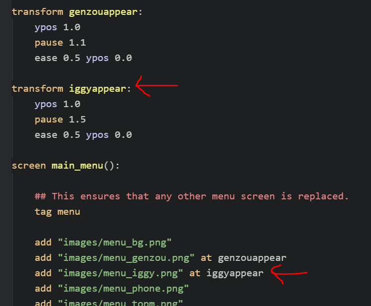
In Iggy's case, we've set a pause of 1.5 seconds, so he should pop in 0.4 seconds after Genzou. Make sure you assign Iggy's new transform to the Iggy image you added, then save and give it a try!
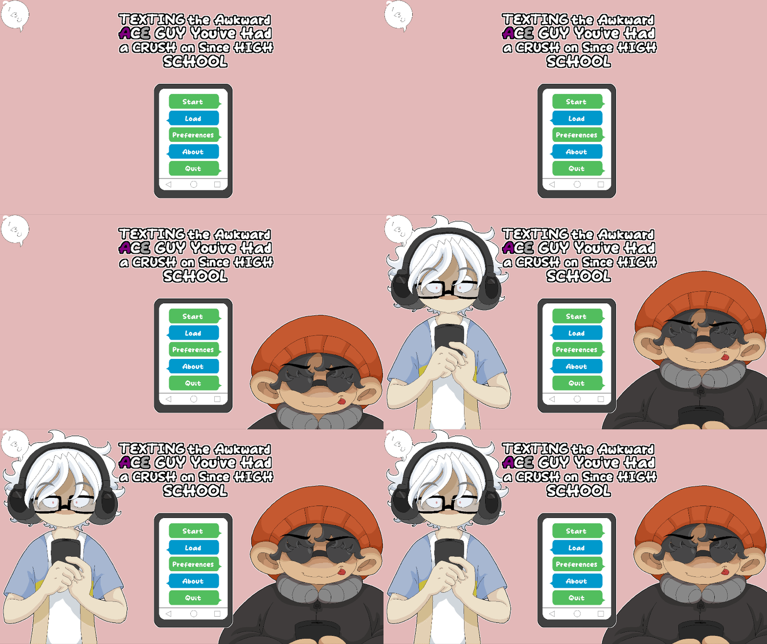
TA-DAH!!!!! Look at how great it's already looking???/???/???//???
Not so hard, right???? UH-OH THE NEXT ONE'S A BIT HARDER. Now we need that phone to appear. It's going to start huge across the screen, then schhooooooooooooom down to its normal size before ending with a little bounce. YIKES. The code for this one took me a lot of trialing and erroring, as per usual, but I'll show you the final numbers I came up with and then explain them:

Similar to Genzou's and Iggy's transforms, the first line here is where the phone will be the moment the title screen loads. In this case, it's........... a lot of different things???????
First, the xsize 4600. This is quite a bit bigger than the actual width of the phone image, which is 1920. Then, ysize 2588, which is similarly larger than its normal height of 1080. (I got these numbers by playing around with the image in GIMP and resizing it so the ratio stayed the same.) The alpha 0.0 next up is important -- alpha controls the transparency of the image, with 0.0 being completely invisible and 1.0 being completely visible. Set at 0.0 here means that the image is completely invisible. Finally, are the xpos and ypos, which are both set to negative numbers right now. That's because the phone image has been enlarged quite a bit, so I needed to set the xpos and ypos lower than normal. I only came up with these numbers through a ton of testing until it looked right -- if you use a different image you want to do something similar with, you'll also probably need to do a lot of testing until you get numbers that look right!
The next line is the pause, of course. In this case, it's 2.6, so 1.1 seconds after Iggy appears. Upon which, the next line will start. This line decreases the size of the phone (resetting the xsize and ysize to the normal size of the image, which is 1920x1080), repositions it to its normal spot on the screen (an xpos and ypos of 0), and makes it visible (alpha 1.0), all in the course of 0.4 seconds with an ease on either side (ease 0.4).
That represents the main movement of the phone! Below that, however, you'll see something called hbounce. This is actually another transform! It's my own sekrit speshal transform I use for... well... a lot of different stuff! It's great! It basically just makes the image shake slightly from right to left. I normally have it defined in my main script file actually, though you can define it in the same place you've been defining these transforms in, too. Here's the code for my sooper sekrit speshal hbounce transform:
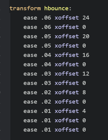
As you can see, it's just a rapid-fire series of eases that change the xoffset of the image, making it look like it's shaking slightly.
So back to the enterphone transform, after the phone has shrunk down to its normal size, it will call the hbounce transform and play it, making the phone shake! After adding both the enterphone transform and hbounce transform, make sure you assign the enterphone transform to the "menu_phone.png" image:
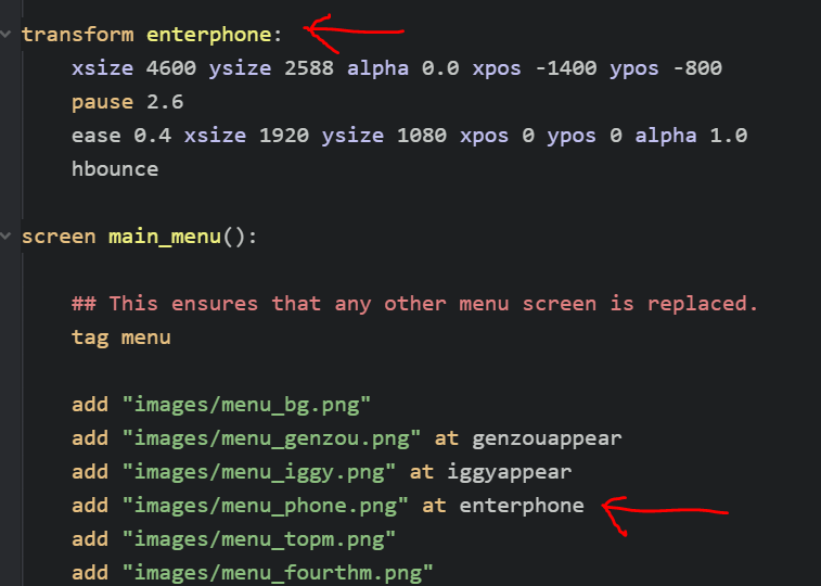
Then, save it and rrrrrrrrrrreload it up!
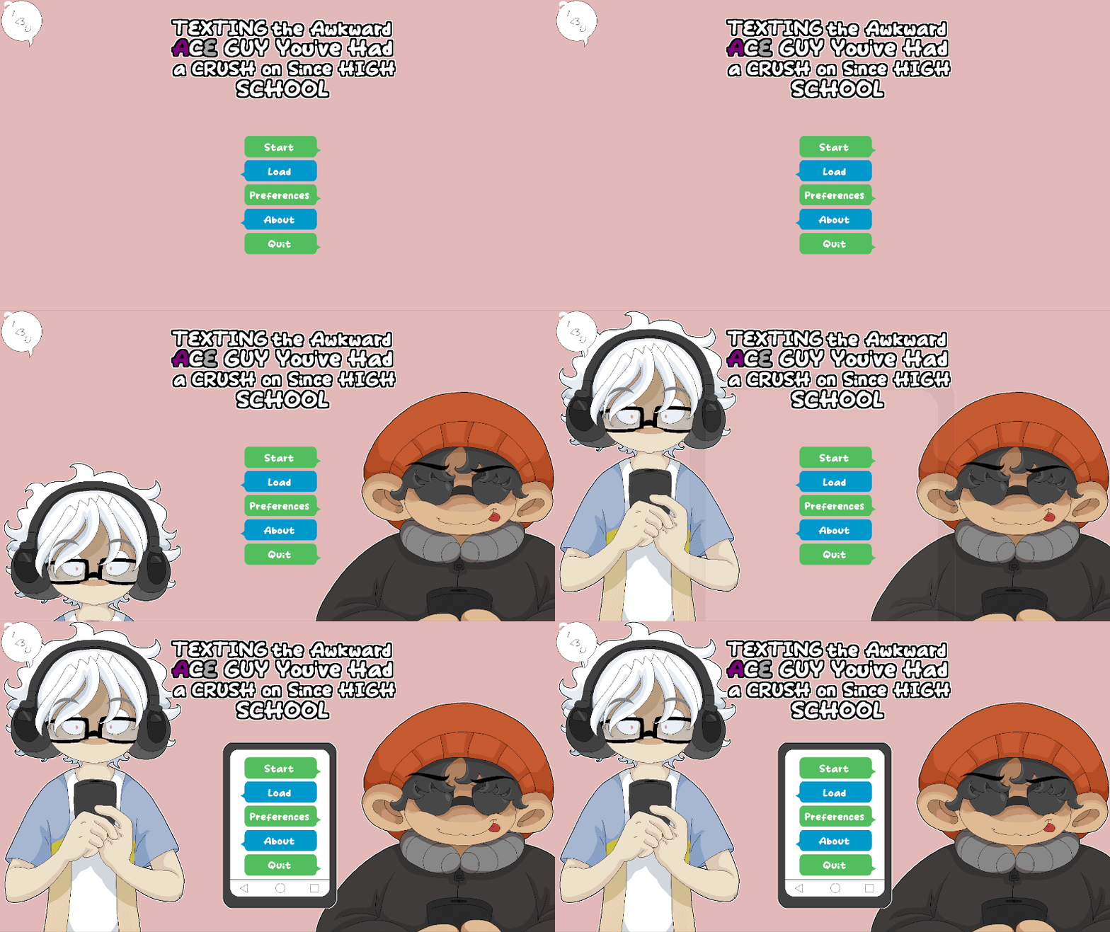
SWEET ACTION!!! LOOK AT THAT PHONE!
Omg this tutorial is getting so long LOOOL but there's still plenty to do! Next up, we need to have each of the message bubbles float in like text messages one at a time from top to bottom. Sounds easy enough, right? Right.
As always, we'll follow the same general method of creating a different transform for each of the message bubbles with a series of commands, then assign each transform to its corresponding message bubble image.
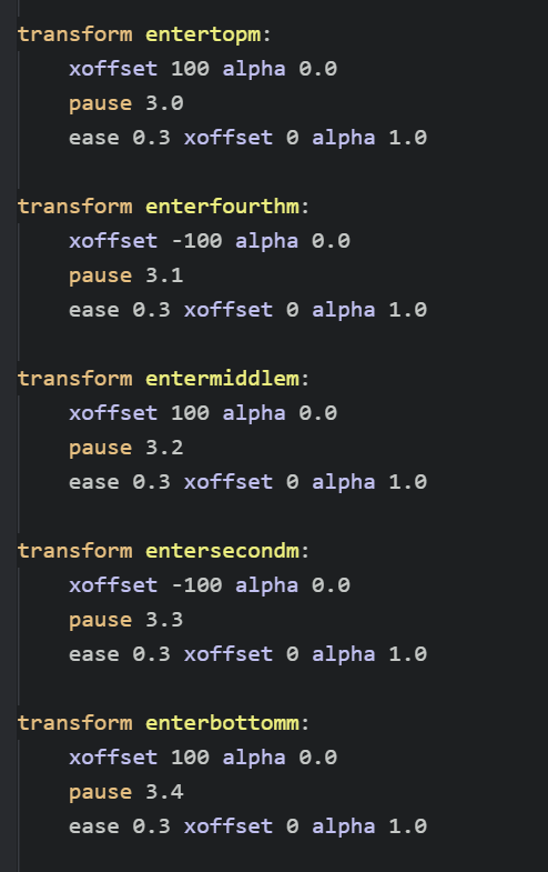
Here are all the transforms for each message bubble from top to bottom! You'll see that each one is either xoffset 100 or xoffset -100 -- this is because every other bubble should come in from right to left, then left to right, then right to left, and so on (opposite of each other). All xoffset does is change the current xpos of the element in question by however many pixels you set. So if the current xpos of an element is 500 and you say xoffset 100, it will change to 600; and if you say xoffset -100, it will change to 400.
So with each of these transforms, the first line sets the xoffset to either 100 or -100 and an alpha of 0.0 (so, invisible). Then a pause. Each pause here is just 0.1 seconds later than the previous one, which will make them appear one after another very quickly. After the pause, we want to get rid of the xoffsets by setting them back to 0, which will reset the image to its normal xpos position, while also changing the alpha back to 1.0 (so, fully visible). This will make each bubble fly in from either the right side or the left side in 0.3 seconds, one after the other, and fading in. Go ahead and write up each of the transforms and assign them to their respective images:
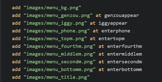
Now, save it and give it a try!

Now that is looking PRETTY sweet. You'll notice the words themselves don't fly in yet -- we need to do that separately for the menu buttons. In fact, let's do that next!
5. Animating the actual menu items??????
Remember that the actual menu items are in the navigation screen rather than the main menu screen. They're all just text buttons, each with the name of what they are, so it's quite easy to determine which is which. You can animate them in the exact same way you animated the message bubbles -- with transforms! IN FACT? YOU CAN USE THE SAME EXACT TRANSFORMS????? Whoa.
Remember that transforms are just a series of commands that tell the element they're assigned to how and where to move. You assigned them to the message bubble images before, which made the bubbles fly in. But if you assign them to the text buttons of the menu, they should theoretically fly in following the same series of commands, right?? Well, let's try it out!
The Start button sits on top of the "menu_topm.png" message bubble, so it should correspond to the entertopm transform. The Load button sits on top of the "menu_fourthm.png" message bubble, so it should correspond to the enterfourthm transform, and so on down for each of the other text buttons. So let's assign them each of their respective transforms using at!
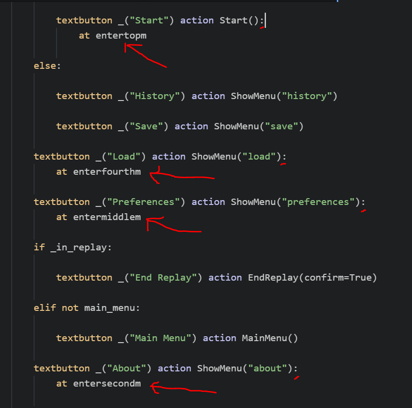
At the end of each textbutton element, add a colon (:), then on the next line, an at, following by the respective transform. You can see in the image this was added for the Start button, the Load button, the Preferences button, the About button, and then not included in the image because it was too far down, the Quit button.
Save it, and check out your new flying in text buttons!
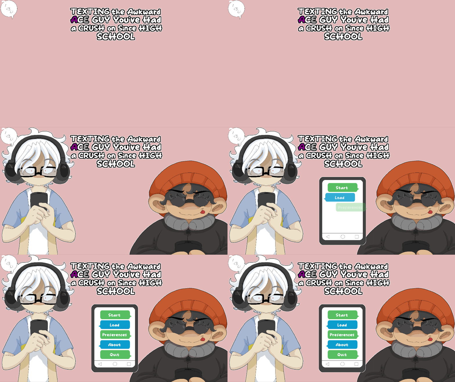
6. Now for the final animated bits!
Whew! All right. Almost done with the main animation????? All that's left is the title and the little bubble and question mark that are still just hanging out over there in the corner lakdjflakds Oh yeah, and we still need to add the flashing light! WE GOT THIS.
Let's do the title next. It's quite simple actually, especially compared to some of what we've just done. All it needs to do is fade in and slide in slightly from the bottom. The transform looks like this:
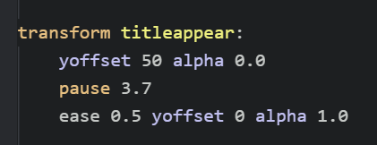
This time, we've got a yoffset rather than an xoffset! This just means it'll be 50 pixels lower than the original ypos. And, as always, we've got our alpha 0.0 so that it'll be invisible when the title screen first shows. The pause is set to 3.7 because it needs to wait for all the other stuff that's already come before it. When designing your own title screen with various elements, you'll want to play around with timing how you think feels good based on the order of things appearing and so on!
Anyway, after the pause, the title will be made visible with alpha 1.0 and will sliiiiiiiide back into its normal ypos by setting the yoffset back to 0.
For the little message bubble and question mark, things will be a little bit trickier again. Not only because we need to set their position manually in the code, but also if you watch the gif, you'll see they have a "pop" effect, where they start out very tiny, then get overly large quickly, then shrink again just a bit to become their normal size.
Here's the transform for the message bubble that will appear above Genzou's head:
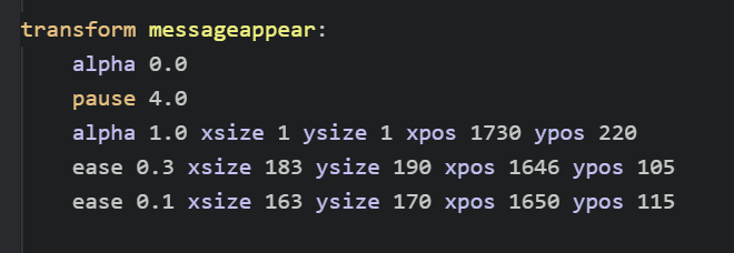
Like all the rest, the first line is ensuring that the image can't be seen, so it sets the alpha to 0.0, then waits for 4 seconds. Here's where the fun stuff starts! The next line makes the image visible -- HOWEVER, AT A VERY VERY SMALL SIZE. The xsize and ysize have both been set to 1 -- THAT'S TINY???? And the xpos and ypos manually set the position of the image to a space just above Genzou's head. So if you were to end the transform right here, it would just look like a tiny little dot suddenly appears above Genzou's head.
On the next line, however, the xsize is set to 183 and the ysize is set to 190 in a span of 0.3 seconds. This is just slightly larger than the normal height and width of the image (163x170). The xpos and ypos are also altered slightly, both of them losing a little less than 100 or so pixels to account for the change in size (I had to test and test and test these many many times LOL).
If you ended the transform right here, you'd see the small dot suddenly grow in size. But that's not enough! We now want it to shrink again just ever so slightly -- giving it a slight pop effect. So on the next line, which happens in just 0.1 seconds, the xsize and ysize are shrunk just a bit (bringing the image back to its normal size), and a few pixels are added back to the xpos and ypos.
Before assigning the new transforms and trying it out, let's also write the transform for the question mark, since it's the final piece we haven't animated yet. It's going to have code nearly identical to the messageappear transform, since the movement and pop effect is the same -- it'll just have some different numbers since we want it to be at a different spot on the screen (by Iggy rather than Genzou).
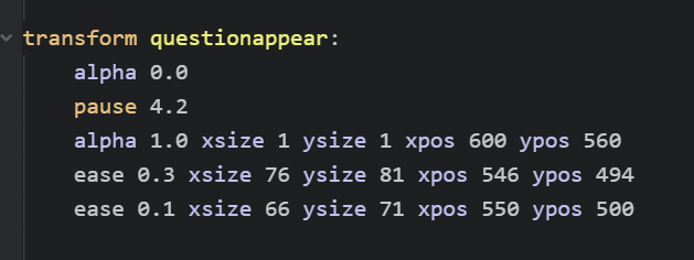
You'll notice much of it is the same -- starting out with alpha 0.0, then a pause (slightly longer than the messageappear pause), followed by a line where the image is given an xsize and ysize of 1. After this comes the line that enlarges the image, followed by a line that quickly shrinks the image ever so slightly right after. As always, these numbers needed to be tweaked and tested to hell and back LOL
Once you've typed all these out, assign the new titleappear, messageappear, and questionappear transforms to their respective images:
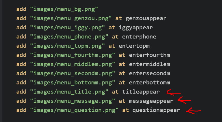
And without further ado, let's save and try it out!

LOOK AT THAT. IT'S ALMOST ALL DONE??????
But there's one more animated part we've yet to get to --
7. OH YEAH, THE FLASHING LIGHT!!! Creating self-animated images... or something...
Let's add that little flashy-flash light that's on the phone This will introduce another fun thing you can do in Ren'Py... which is creating images that have bits of animation actually built into themselves!
WHOA. CARROT. WHAT DO YOU MEAN BY THAT????
Well, until now, you've been using transform elements to add animation to all your images, right? Another way you can add animation, though, is directly within a defined image itself! This will allow us to add an animated image and then apply yet another transform on top of it, which is exactly what we'll be doing here. This technique is also great if you want to add like, animated images within your game in general.
If you've used Ren'Py at all before this, you probably already know that you can define images. For instance, if you want to load a sprite into your game, you define it first using something like image genzou happy = "genzou_happy.png" or something like that. Then, whenever you want to show this image, you can just say show genzou happy.
Well, within that image definition, you can actually include more than just a single static image file! You can include... multiple image files! Or... various transform effects! And then all of that will be included within that defined image and be displayed when you call it.
Here's an example of this from my main game:
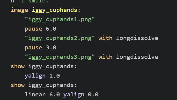
Here, I've defined an image called iggy_cuphands. Within that defined image, though, are three different png files -- "iggy_cuphands1.png," "iggy_cuphands2.png," and "iggy_cuphands3.png." And not only that, but there's some other commands in there! For instance, there are pauses between the different files. And each file will be shown with a separately defined transform called longdissolve, which slowly fades the image in. All of this is included as a single "instance" so to speak within the defined iggy_cuphands image.
THEN. I can call that defined image using show iggy_cuphands, and it will display that defined instance, complete with all the included files and animation and pauses. I can even show it using other various transformations -- you can see that I've called it first at a yalign of 1.0, then have it shift to a yalign of 0.0 over the course of 6 seconds. This allows me to apply the overarching yalign transformation on top of the defined image, that will continue to change according to its own inner definition. On the screen, then, it will look like this:
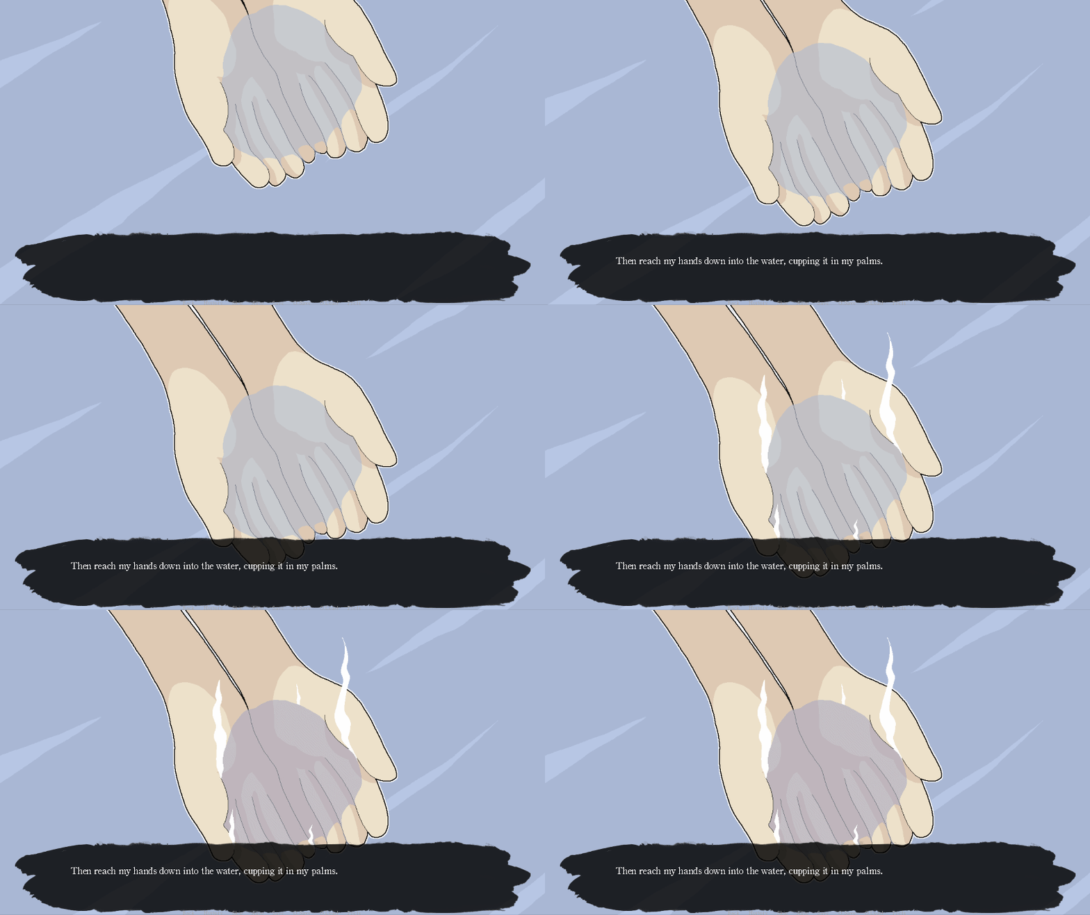
The image pans upwards according to the yalign shift, and then also changes according to the inner definition that changes to a different png file (the steam appearing, etc.) after a certain number of seconds.
OK BUT WHAT DOES ANY OF THIS HAVE TO DO WITH THE LITTLE ANIMATED FLASHING LIGHT???????
Well, you're going to do the same thing with the light! It will be a defined image with its own "flashing" animation, that you'll then add to the title screen and apply a second transform element on top of it so that it will appear at the correct time. WHEW!
Let's start by defining the image with the flashing animation:
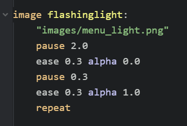
Here, a new image is defined called flashinglight. On the first line, we tell it what image file to actually use, which, in this case, is "menu_light.png," the little green dot. It we left it simply at that, this image would simply be an unmoving little green dot. But we want it to flash on and off, similar to a message notification light! So after having it pause for 2.0 (i.e., show the light for 2 seconds), we then tell it to change the alpha of the image to 0.0 over the course of 0.3 seconds, making it look as though it's disappeared! Then, another pause, much shorter this time (since we want it to disappear only for a short moment), followed by setting the alpha back to 1.0 so that it reappears. This is followed up by the repeat command, which will make it so it keeps looping this series of commands again... and again... and again... perfect!
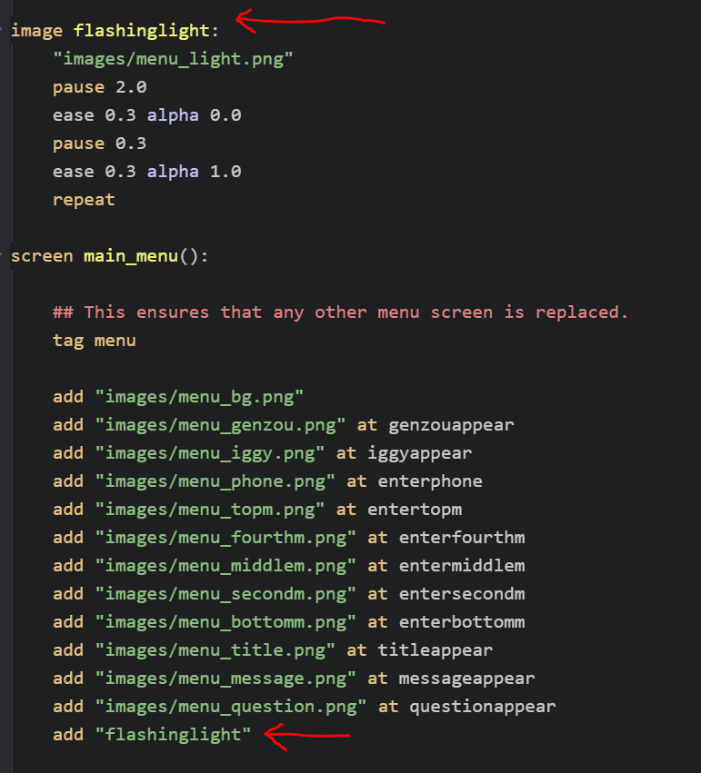
After you've defined the image, go ahead and add it the same as you added the other images in the list of images on your title screen. See what it looks like!
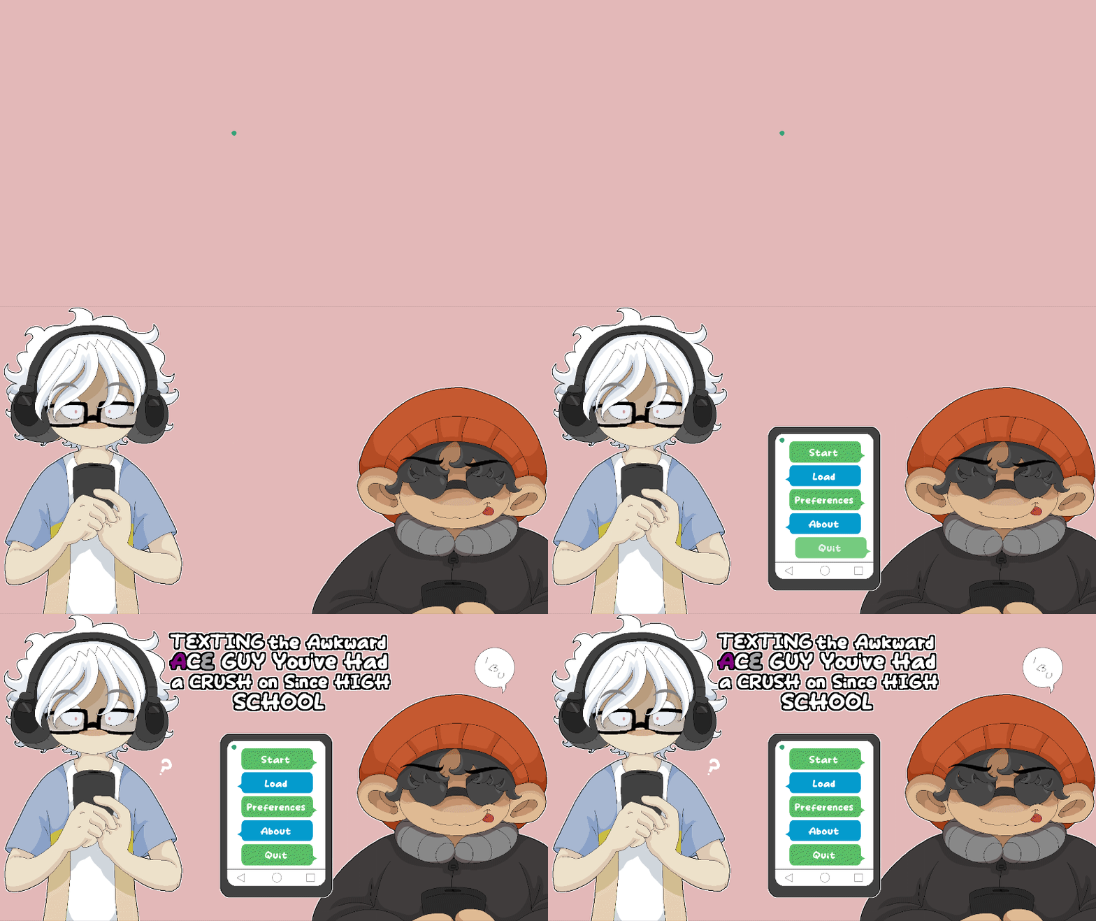
LMAO. Well, the animation is working!! It's certainly flashing! However... it appears way too early! We need to have it only appear and start flashing after everything else has appeared; otherwise, it looks a bit tacky..............
Fortunately, this is vey easy -- you just need to create another transform for it, the same as you did for all the other images!
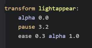
This one is very simple! All you need it to do is hide the flashing light when the title screen first appears (alpha 0.0), then wait 3.2 seconds (the combined time of all the previous images appearing), then become visible (alpha 1.0). Easy cheesy!! Now go ahead and assign that transform to your flashinglight...
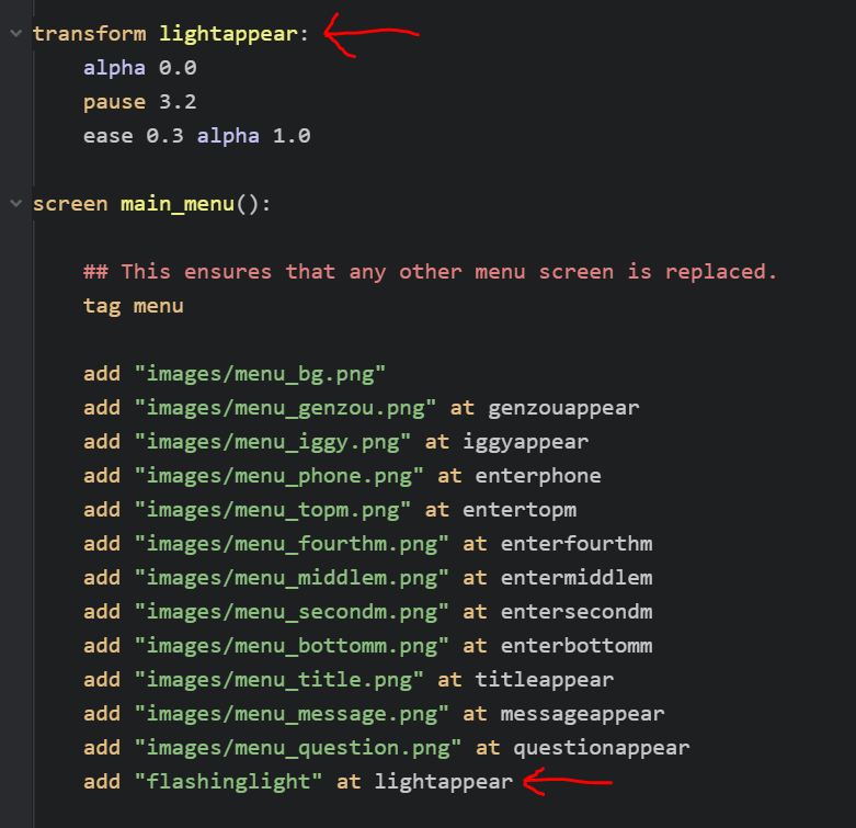
.....aaaaaaaannnnnndddddddddd SAVE IT AND TRY IT OUT OMG I HOPE IT'LL WORKKKKKKKKKKKKKKKKKKK.

YEAAAAAAAAAAAAAAAAAAAAAAAAAAAAAAAAAAAAAAAAAAAAAAAAAHHHHHHHHH.
LOOK AT THAT SWEET ACTION.
Every single element is now ~ beautifully animated ~ GIVE YOURSELF A PAT ON THE BACK!
BUT WAIT. THERE'S SOMETHING WRONG. SOMETHING INCREDIBLY IMPORTANT THAT WE STILL NEED TO DO OR ALL. WILL. BE. LOST.
8. FIXING ALL THE OTHER MENUS YOU JUST TOTALLY SCREWED UP.
OK remember when I was rambling on about the three different versions of the menu and all that and the whole time you were like what is even the point of this and then I've barely even brought it up again.
WELL. THAT'S ABOUT TO BECOME REALLY REALLY IMPORTANT.
WHY?
Well, try clicking the Load button and see what happens:

THAT'S CERTAINLY NOT SUPPOSED TO HAPPEN!!!
The menu is doing the same thing it does on the title screen -- but in the menu??? It's not in the right place and it takes forever before it finally appears! This is because you haven't told Ren'Py you only want it to look like that on the Title Screen but not anywhere else. So the last job we have before all of this is finished is to add some conditions and tweaks so that the menu shows up the way it should in all three instances where it's shown -- on the Title Screen, in the Game Menu from Title Screen, and in the Game Menu from In Game.
Remember the if not statement you used to make it so the Help button only appeared if not on the main menu? You'll be writing a bunch of other statements similar to this! That's really all coding is to be honest -- telling stuff to do other stuff only very specific certain conditions (much like my life).
Let's start by getting rid of the animation while on the game menu screen (that pause before the menu appears is rather annoying!!). This is quite simple! You initially added the animation for the flying in buttons via this code here:

You assigned the entertopm transform to the Start button. Well, now, you only want it to assign the entertopm transform if you're on the Title Screen. So, essentially... if on the Title Screen, assign entertopm. The code to do this is, well, basically exactly that:

You'll notice this code looks slightly different than what you did for the Help button. That's because you wanted the Help button to only appear on the Game Menu from In Game -- but not on either the Title Screen or the Game Menu from Title Screen (remember the three versions). This time, however, you only want this animation on the Title Screen -- but not on either the Game Menu from Title Screen or Game Menu from In Game. The way to access only the Title Screen but not the other two is via the renpy.get_screen("main_menu") command.
Go ahead and add this if statement above each of the transforms you added to the navigation buttons, making sure you indent the transform underneath like you see in the above image. Save and reload the game, and now when you click on Load to open the menu, it'll still be in the middle of the screen, but at least the buttons don't fly in (one step at a time LOL):
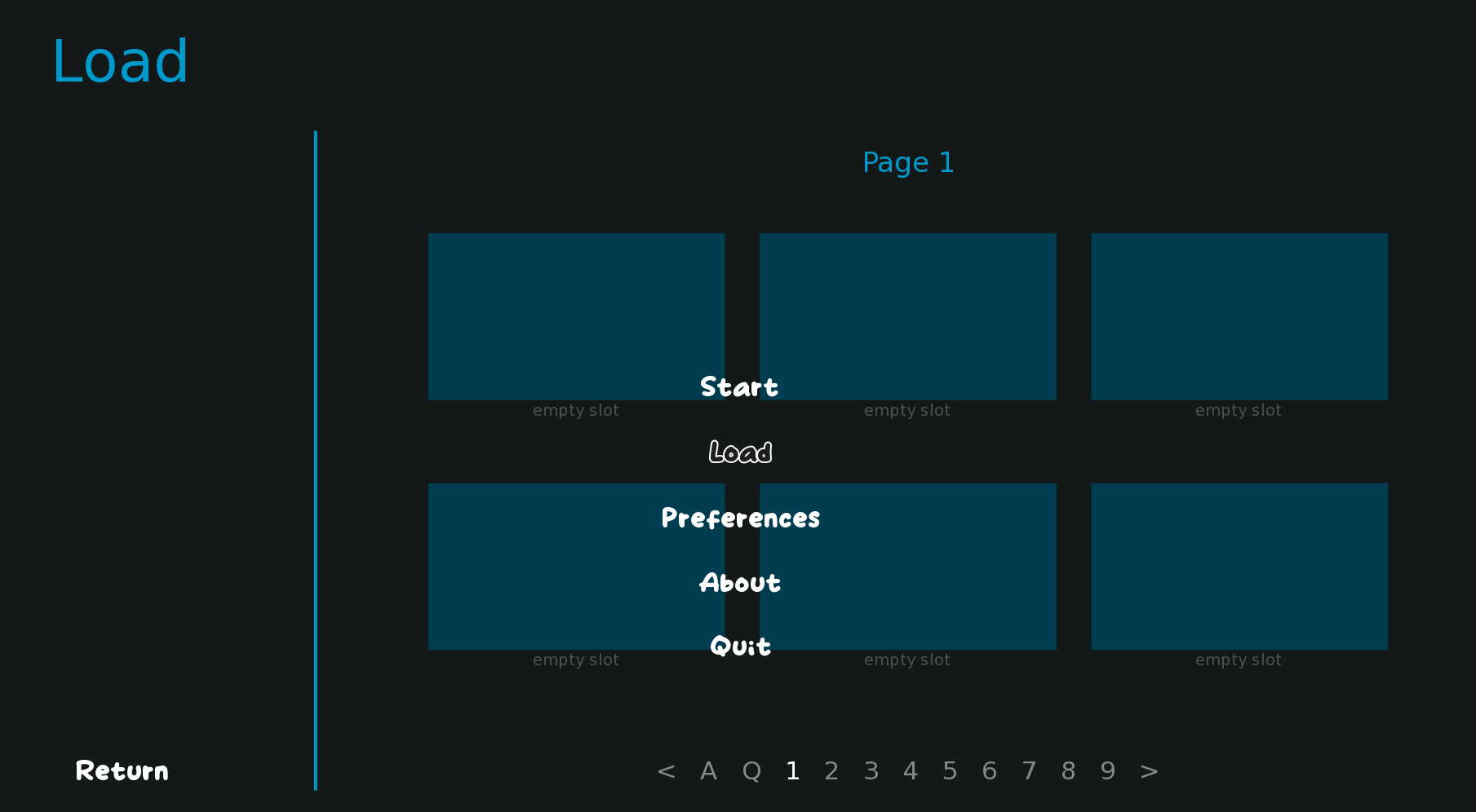
OK great. Now let's move it back over to the left where it's supposed to be!
For this, you'll want to think back to the original code you wrote to center the menu:
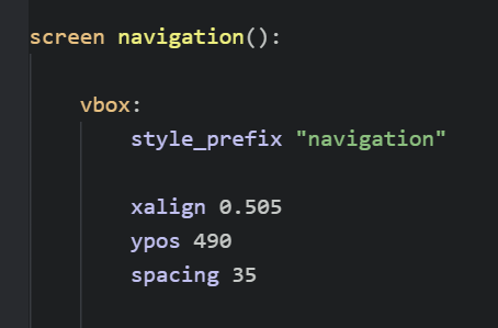
If this bit is what's centering the menu, then we need to make some sort of conditional here (an if or if not statement) so that the menu is only centered on the Title Screen. So, essentially, the same thing you just did with the transforms, but now on this bit.
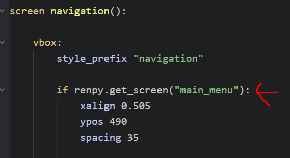
Notice how it's the same exact code: if renpy.get_screen("main_menu"). Sweet! As always, make sure the three lines beneath it are indented so that they're applied to the if statement. Then save and see what happens.
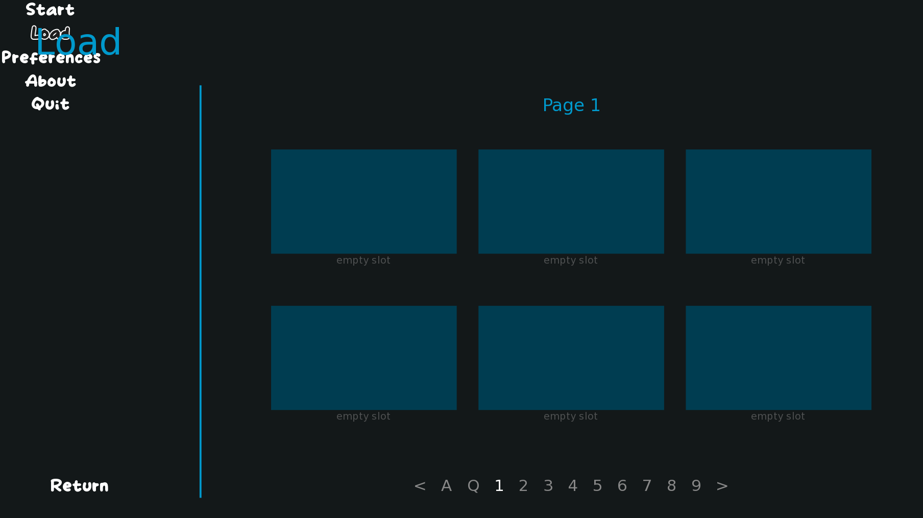
OK we're getting somewhere! Not somewhere good yet. But. Somewhere!!!
Why is the menu now in the top left? Because that's the default position of xpos 0 and ypos 0. With the previous if statement, you made it so only the menu on the Title Screen had any manual positioning applied to it, so now that we're on the game menu, it's reverted back to default. To fix this, we'll need to add back in some manual positioning. And you'll do this via an else statement.
If else statements work pretty much how they sound -- if something, do this; else if not, do something else. Right now, you only have an if written, but no else. So it's not doing anything if not on the Title Screen (thus, the default positioning). However, we want to set a different positioning if not on the Title Screen. So let's add an else!
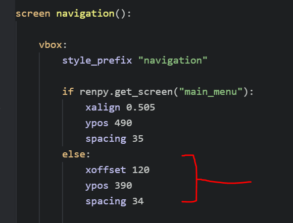
Right below your if statement, add an else. You can then set the positioning however you want! The numbers provided here will position it pretty nicely right in the middle vertically and at an aesthetically pleasing position horizontally compared to the other default stuff happening on the screen:
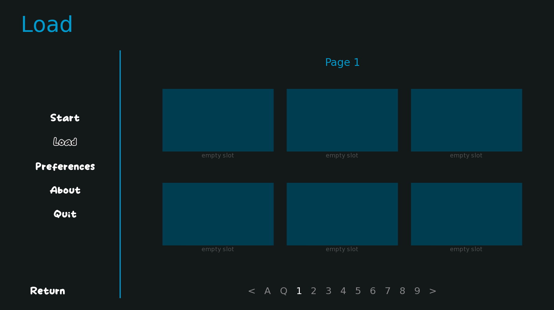
Wonderful! This at least works well for the current UI setup. Though note that if you decide to change your menu UI or rearrange things, you'll likely need to come back and tweak these numbers accordingly.
BUT WAIT. THERE'S MORE.
Remember that there are three versions of the navigation menu. You've now ensured the Title Screen and Game Menu from Title Screen look fine. But what about the Game Menu from In Game? Try starting up a new game via the Start button, then opening the menu:
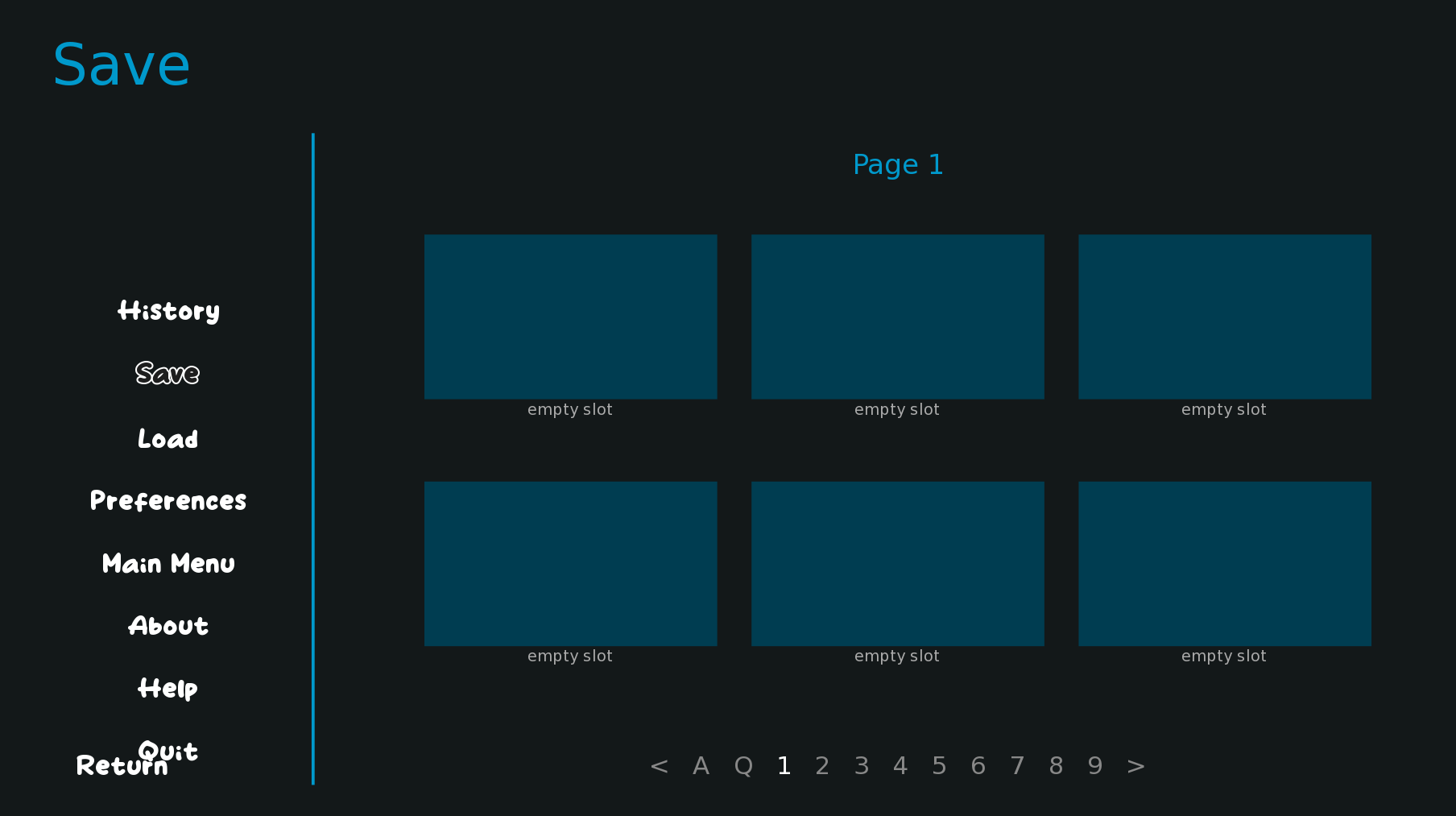
EGADS!!! That doesn't look right!! That's because the Game Menu from In Game has more buttons (a History button, a Main Menu button, and a Help button), so with the current placement, it goes too far down. But that's OK! We can fix that.
This time, we're going to use what's called an elif statement. You use elif statements if you have an if else statement that needs more elses, basically. Right now, it's just if this or if not this. But with three different screens, we need if this, or else if this, or else it not either of this, essentially. Which is exactly what the elif statement is for!
The elif statement will have the manual positioning for our Game Menu from In Game version of the navigation menu, and it needs to go between the if and the else:
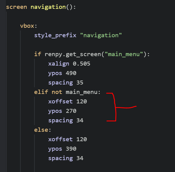
You'll notice the actual numbers are very similar to the else statement -- with the only difference being the ypos is much less, as we want it to be higher on the screen. This trio right here also gives you a summary on how to access each of the individual screens -- accessing the Title Screen is done via renpy.get_screen("main_menu"), accessing the Game Menu from Title Screen is done via if / if not main_menu, and then anything else is the Game Menu from In Game. If that makes sense. I'M TRYING TO EXPLAIN IT THE BEST I CAN.
Save it and see what happens:
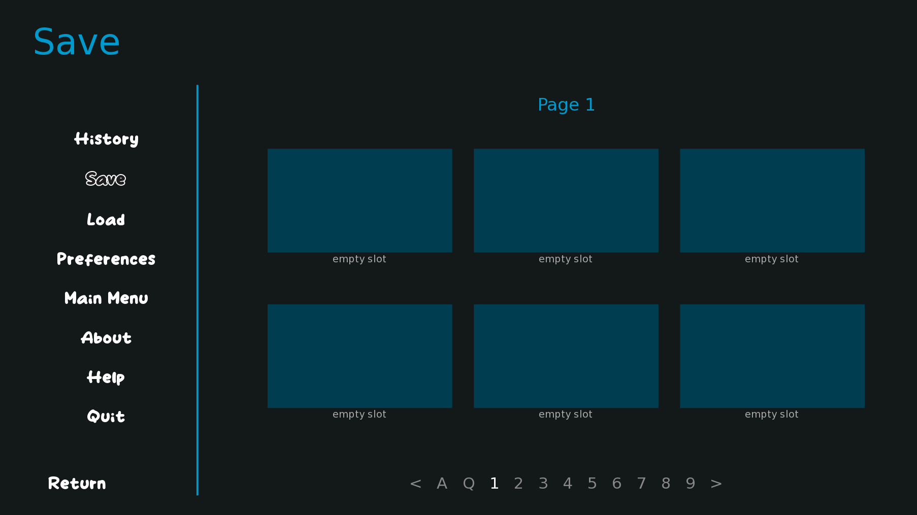
LOVELY!! That looks much better. Now, each of your three menus is in the right place!
You, of course, could do this in an easier way by having everything that's not the Title Screen be positioned vertically via a yalign 0.5 (which will center the menu vertically on the screen):
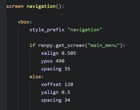
And this will work for a lot of cases (in fact, probably most cases tbh lol)!! However, for my game specifically, I have some additional message bubble stuff and animations set up on my different menus that needed to have different code between the Game Menu from Title Screen and Game Menu from In Game, so I needed to set things very specifically for each of the different instances. And I figured I'd show you how you can manually access each of the different menu versions in case you need to for whatever reason, too! Feel free to use either the more complicated way or the simpler way in your own game depending on your needs!
And that's that!! You now have a lovely animated title screen -- and it hasn't messed up any of your other menus either!! CONGRATS!!!!! Let's take a look at the whole thing in action:

9. What else can you do from here????????
Of course, there's a whole bunch of other cool things you can do with your menus now that you've got some of these basics down. Because really, you now know most of the different ways to not only manipulate and animate stuff, but how to access all the various parts of the menu in its many places, as well. So it's figuring out how to tweak the code you already know to apply to other various things and in other various situations.
For instance, in my game, I use the same animated fly-in effect from the title screen also in the game menus, just much more quickly:
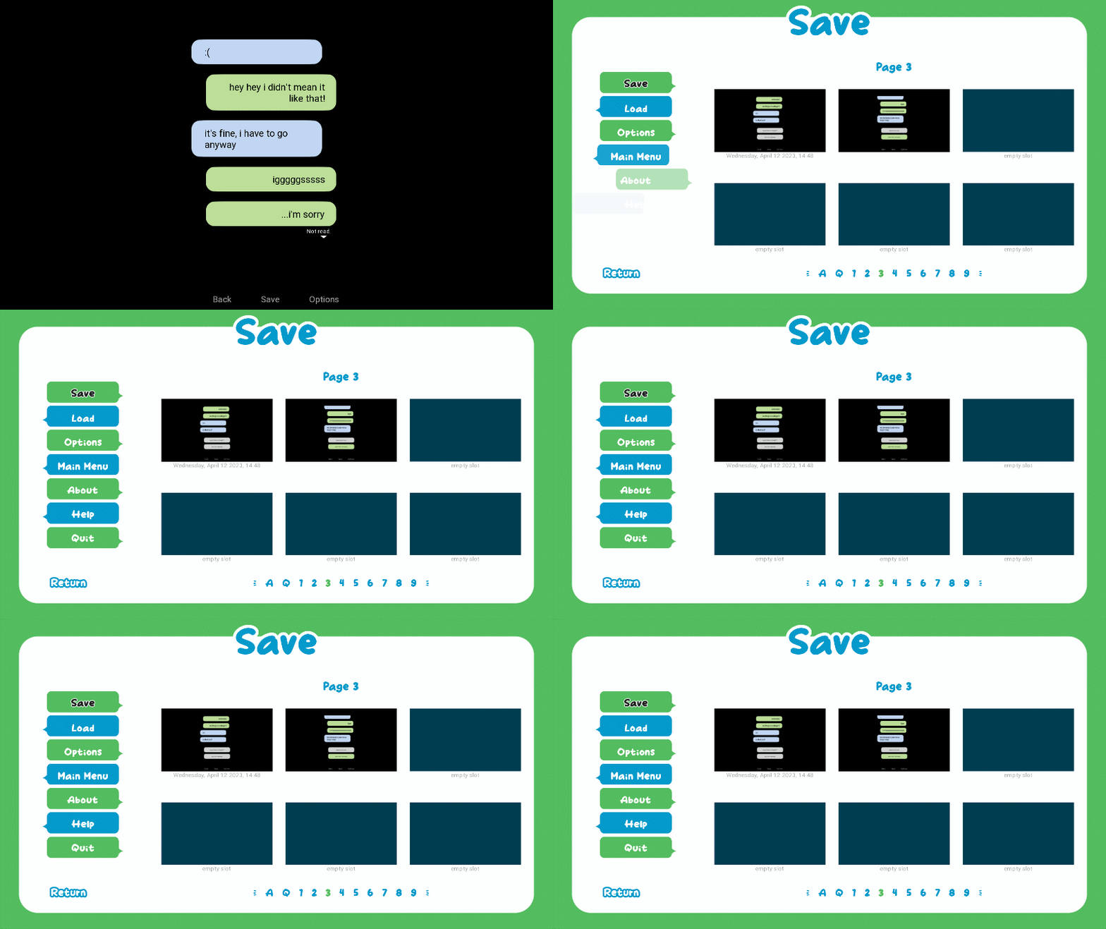
For this, I use a combination of similar transforms that are only called for each specific version of the menu.
And remember that little pop effect animation you used to make the message and question mark images appear on the title screen? You can use that same basic concept to create a transform to animate, for instance, the notification menu, and make it pop onto the screen:
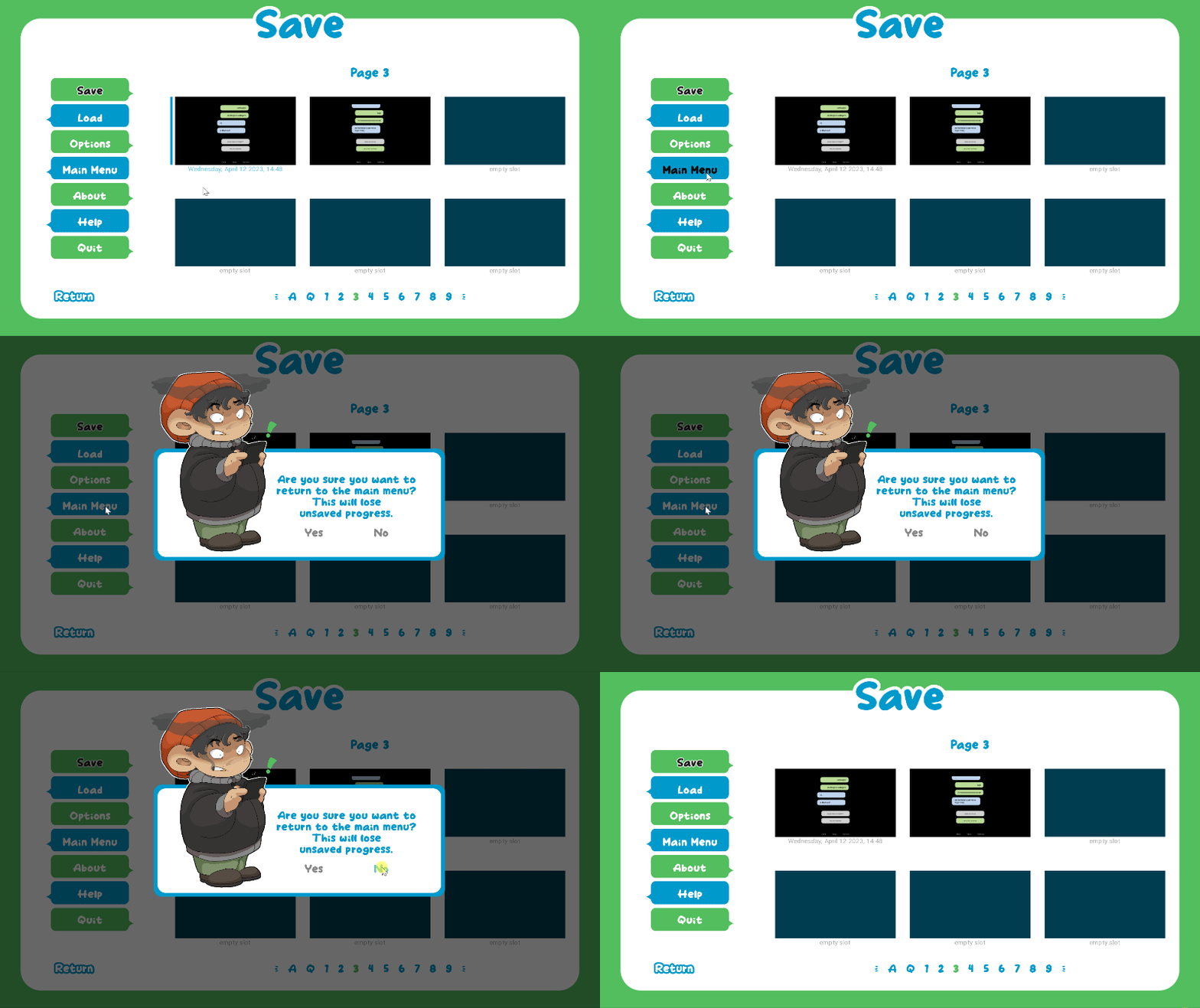
If anyone wants walkthroughs for how to do some of this other stuff, feel free to let me know!! I can make smaller tutorials for like, creating a notification pop-up window or other various small animation bits, too! Or literally anything else! If there's something you've seen in one of my games, for instance, that you wanna know how to do, just let me know! I was already thinking also of making a tutorial for the slide-in, slide-out menu I have in Our <<Fantastic>> Wonderland as I thought there might be others who want to make something similar. But yeah! I'm happy to make tutorials for anything!
Also unsure if I should make a video tutorial version of this.... I've never made a video before and I'm a bit shy alkdjflakdsf but if it would be helpful for people to have a video version to follow along with, too, I shall consider it LOL
And that's it for this tutorial! I hope you were able to follow along with it OK. But since this was the first tutorial I've written, I may have missed some stuff that could make it easier or what-not. So just let me know if there's anything that's unclear or any parts you don't understand and I can try to fix them or make them better. Or if you just have any general questions or run into any trouble, just let me know and I can try to help!!!
THANKS FOR READING!!!!!1!!!!1!!!
Files
Get Texting the Awkward Ace Guy You've Had a Crush on Since High School
Texting the Awkward Ace Guy You've Had a Crush on Since High School
Can you ace it?
| Status | Released |
| Author | Carrot |
| Genre | Visual Novel, Interactive Fiction |
| Tags | asexual, Boys' Love, Cozy, Cute, Gay, LGBT, LGBTQIA, Queer, Romance |
| Languages | English |
| Accessibility | Blind friendly |

Comments
Log in with itch.io to leave a comment.
This was a super helpful guide!!! Definitely going to try to use this in my projects more >:D Thank you for all the work you put into this!
Oh my goodness I would absolutely love to have a tutorial on how to do the pop up notification, I'm kinda obsessed with adding all kinds of personality to my game and that's exactly what I need!!
Super super helpful tutorial also, thank you so much!
I absolutely love your tutorial! Followed it through and now I know how to be creative with my main menu! Thank you so much :)
ello! so i am messing with the code right now and i ran into a problem, the "elif not main_menu:" Is not working this error keeps popping up
and here is what it looks like in the code, I don't know where i went wrong.
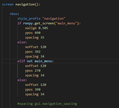
Ohhhh taking a look at your code, it looks like you have two many `else`s? And the `else` should always come at the end of a list of ifs.
So you can have:
`if...`
`elif...`
`elif...`
`else...`
In that order, but you can't have an else before an elif and you can only have one else total?? So I would move your `elif` beneath your `if` and get rid of one of the two `else`s. Does that make sense/help at all? 🤔
omg as someone who struggles a lot with animations and code this is SO HELPFUL fr 😭😭😭
most animation tutorials just. don't work when i try to put on my code. but i tried one of yours and IT WORKED ????????????????!!!!!!!!!!!!!!!!!!! IM GONNA CRY????????????????
i will definitely come back here many many times, thank you!!!!!!!!!!!!
i also loved the detailed explanation....... mostly people just push a bunch of lines to you and says it works but when you try to do it errors happen and you don't know why... also, seeing YOU facing errors was relieving... it includes a essencial part of what coding is and also helps to keep everything in check...
really, thank you!!
HELP I MISSED THIS SOMEHOW
THANK YOU?? I'm really glad this could be helpful!!! I am also really bad when it comes to tutorials, especially when I'm brand new to something, so I really tried to make this as clear as I could and like, explain all the little things that I remembered also not quite understanding or that made me scratch my head.
I'm really glad you were able to follow along!! May you use it to create many wonderful animations!! 🥺💕
Awesome tutorial!! :D
AHHHHH THANK YOU VERY MUCH!!! I hope it can come in handy!! 🥰
I don't use Ren'py, but I am flabbergasted at how thorough this is?! I read through it because it was so interesting and well-done; bookmarking it in case I ever use Ren'py in the future!! Fantastic work!!
LKDJFALKDSJFLAKD MAYBE A BIT TOO THOROUGH. I just so desperately wanted to make sure I explained everything as thoroughly as possible and didn't like, accidentally gloss over something that's actually hard to understand LMAO
HELP THANK YOU FOR READING IT THO EVEN THO YOU DON'T EVEN NEED IT???? kdjlfakdsjfa I shall weep... 😭💕 Thank you so much for your kind words owowowowow....
Actually now I'm curious what engine do you use??
Ah, I use Unity! When I first started development it was one of the only engines that was supported by the animation program that I use...I do want to use Ren'py though, it has so many convenient features and the new features look awesome!
OHHHHHHH!! I see. That makes sense then -- I feel like so often the engine/tools we end up choosing are based on some other tool or thing we know. Either that or it's just completely random!! 🤣 I know nothing about Unity though... even though I would love to learn eventually. I think I need to get better at wrapping my head around code a bit more first though lol.
This is the most beautiful tutorial I've ever read! I love this!!!!
FHDJDJDJF MOST BEAUTIFUL. YOU ARE TOO KIND 😭💕
Guhhh I am glad though!!! I hope it can be at all helpful even in parts!!!
Thank you for the tutorial! ✨
YOU ARE WELCOME!!! I hope it will be helpful to people!!!!! 🥺💕